
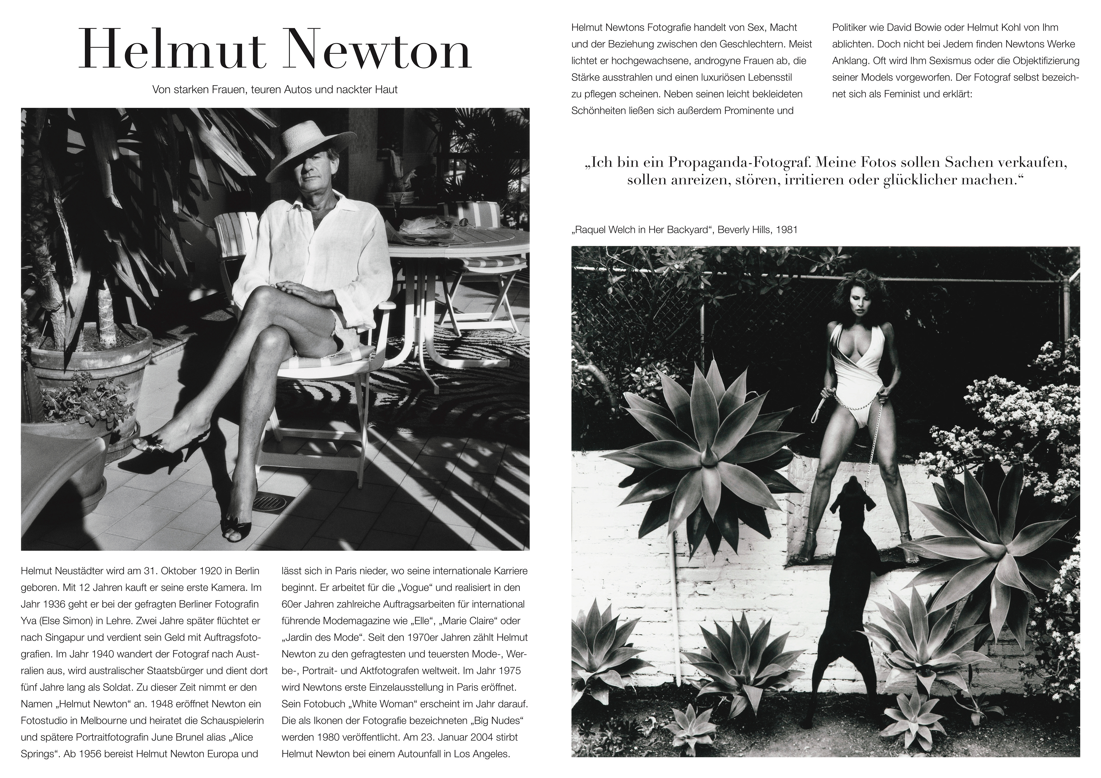
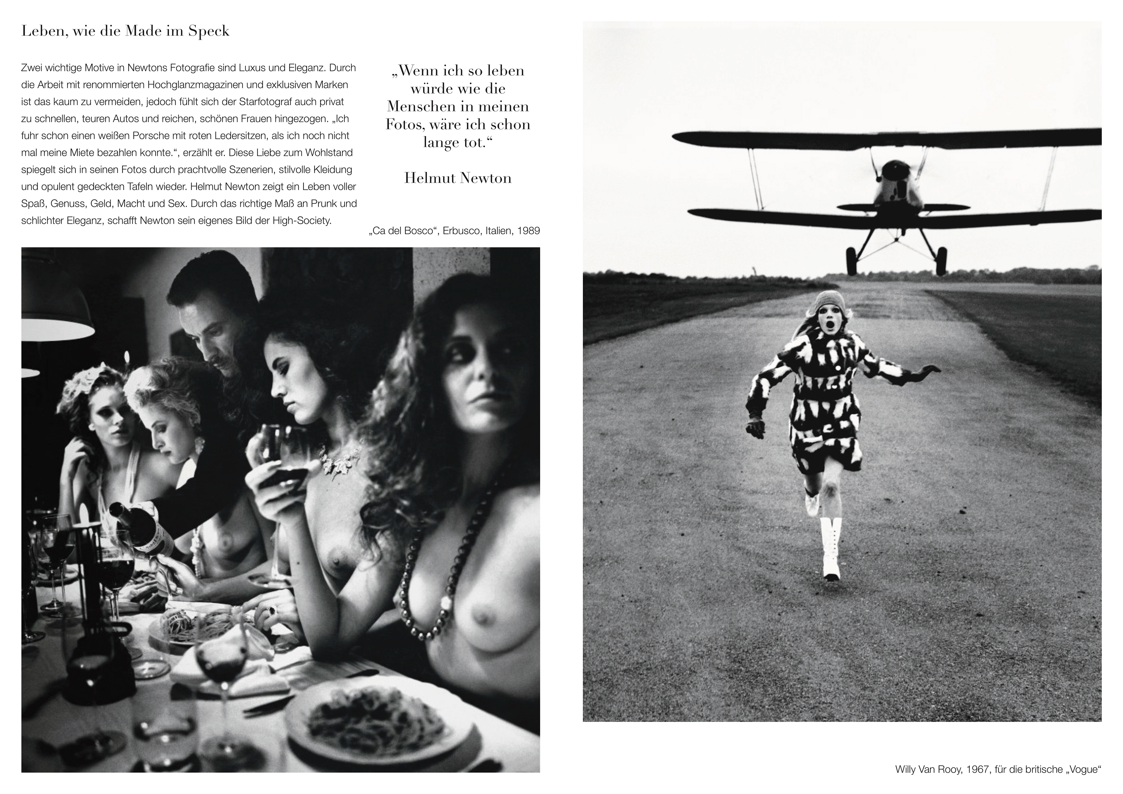
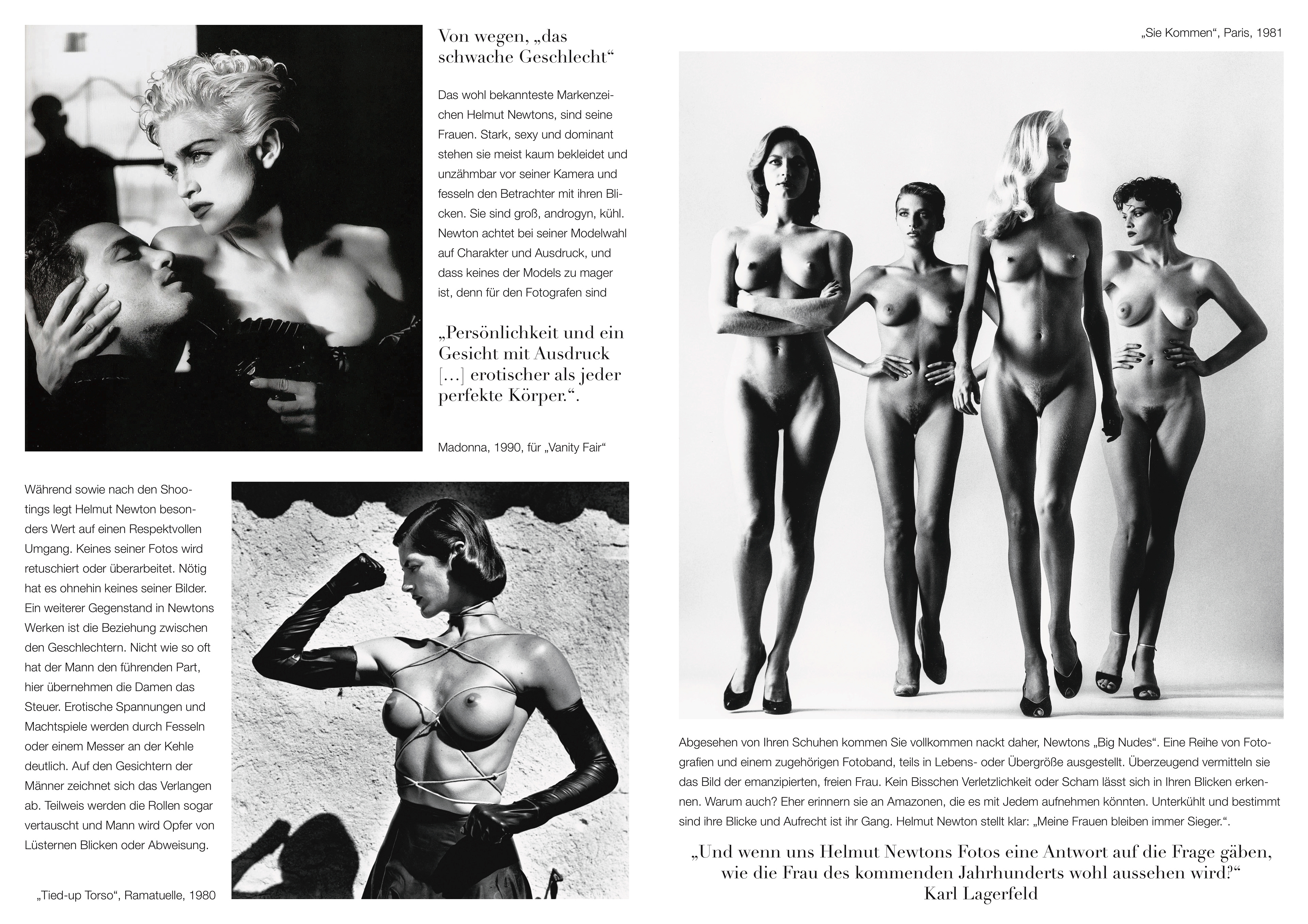
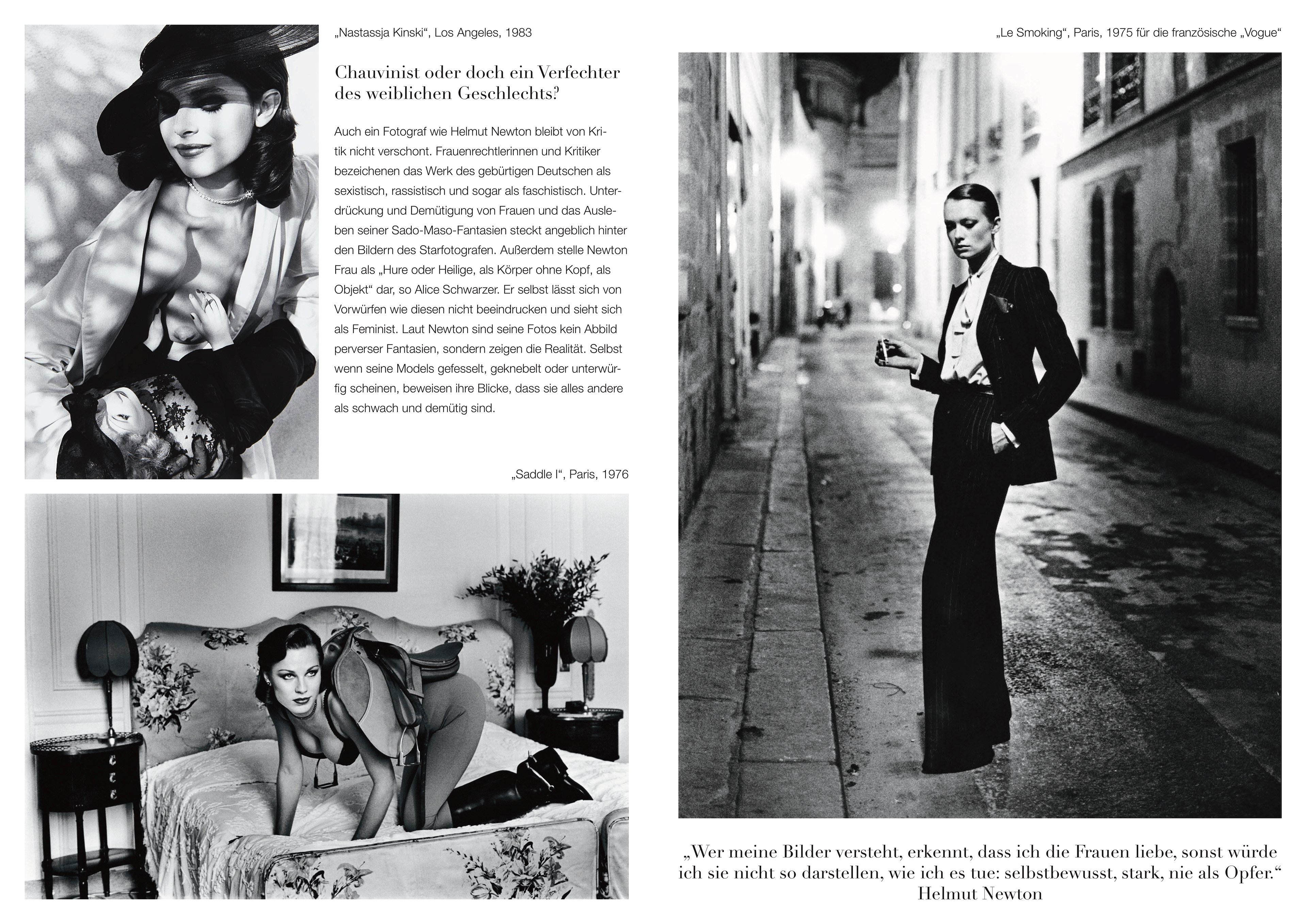
Entstanden ist dieser Katalogtext im Laufe eines Kurses. Die Aufgabe bestand darin, einen Katalogtext in sauberer Typografie und klarem Layout zu einem Kreativen der eigenen Wahl zu verfassen. Schwarz-weiß, schlicht und elegant wie Newtons Bildmotive muten die vier Doppelseiten an. Auf die "Didot" konnte im Zusammenhang mit Helmut Newton nicht verzichtet werden, die dieses Erscheinungsbild zusätzlich unterstützt. Der Fokus liegt auf seinen Fotografien, da sie für sich sprechen und man keinen Künstler versteht, ohne seine Werke zu kennen.
This catalogue text was created in the context of a course. The task was to write a catalogue text in clean typography and simple layout for a creative of our own choice. Black and white, simple and elegant, the four double pages appear like Newton's motifs. The 'Didot' could not be renounced in connection with Helmut Newton, which also supports this appearance. The focus lies on his photographs, because they speak for themselves and you will not understand an artist without knowing his works.
Die Rechte der verwendeten Fotografien und Schriften liegen nicht bei mir. Hierbei handelt es sich um keine Kommerzielle Arbeit, sondern um ein Projekt, welches im Kontext meines Studiums entstand.
I do not own the rights regarding the used photographs and fonts. This is a non-profit project which was done in the context of my studies at Peter Behrens School of Arts in Düsseldorf.